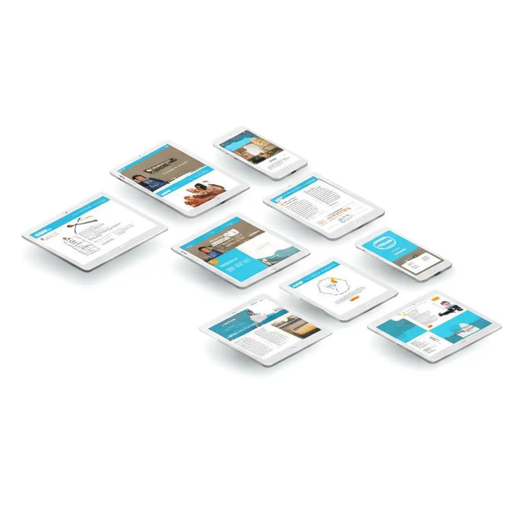
`responsive-design` Related Article Results

CSS (Cascading Style Sheets)
CSS (Cascading Style Sheets) is a style sheet language used to format the visual presentation of HTML documents. First standardized in 1996 by the W3C (World Wide Web Consortium), CSS has become a fundamental component of modern web design by separating structural content from visual layout. CSS allows developers to control properties such as color, size, positioning, and alignment of texts, images, and other elements used within HTML documents. In this regard, CSS contributes to making digital
EN
Okan Kanpolat

Bootstrap
Bootstrap is an open-source CSS framework developed by Twitter. Modern and HTML include CSS and JavaScript components for building responsive websites. It particularly facilitates fast prototyping and development processes.HistoryBootstrap was developed in 2011 by Twitter engineers Mark Otto and Jacob Thornton. Originally designed as an internal tool for Twitter, this framework was later released as an open source and rapidly gained popularity. Today, Bootstrap is used by millions of websites.Bo
EN
Arif Zahid Yüksel
 Ta
TaTailwind
Tailwind CSS is an open-source CSS framework developed by Adam Wathan. It aims to facilitate the creation of modern and responsive websites through low-level utility classes. Its flexibility and customizable structure are prominent features of the framework.HistoryDevelopment of Tailwind CSS began in 2017 by Adam Wathan and his team. The primary goal was to simplify the styling process using a Utility-First approach. The framework rapidly gained a large user base within short and is now used in
ENArif Zahid Yüksel

Responsive Design
Responsive design is an approach to designing websites and applications so they adapt to different screen sizes and devices. Interfaces created using this method provide a user-friendly appearance on all devices, from desktop computers to smartphones. Responsive design has become the standard in modern web development for enhancing user experience and facilitating content access across various devices.Key FeaturesThe prominent features of responsive design are as follows:Flexible Grid Systems: P
EN
Necati Arman
Responsive Design
Responsive Design is a web design approach that aims to provide a user-friendly and accessible experience across different devices and screen sizes. This design model ensures that digital content can be displayed without distortion and without the need for restructuring across various hardware platforms, such as desktop computers, tablets, and smartphones. The concept of responsive design was first defined within an academic framework by Ethan Marcotte in 2010. With the advancement of web techno
ENOkan Kanpolat